M-SELEN
Building trust and coherence for a mobile money platform
The Client
Project Scope
M-Selen, launched by Our Telekom with Australian government and UNCDF support, is Solomon Islands’ leading mobile money service.
Beyond transactions, it’s a financial inclusion engine—linking remote communities, boosting literacy, and sparking economic growth. Affordable and visionary, it aligns with the nation’s Financial Inclusion Strategy, weaving underserved regions into a connected, thriving future.
Brand Strategy
→ brand purpose, promise, personality
→ customer journey
→ marketing brand analysis
Brand Identity
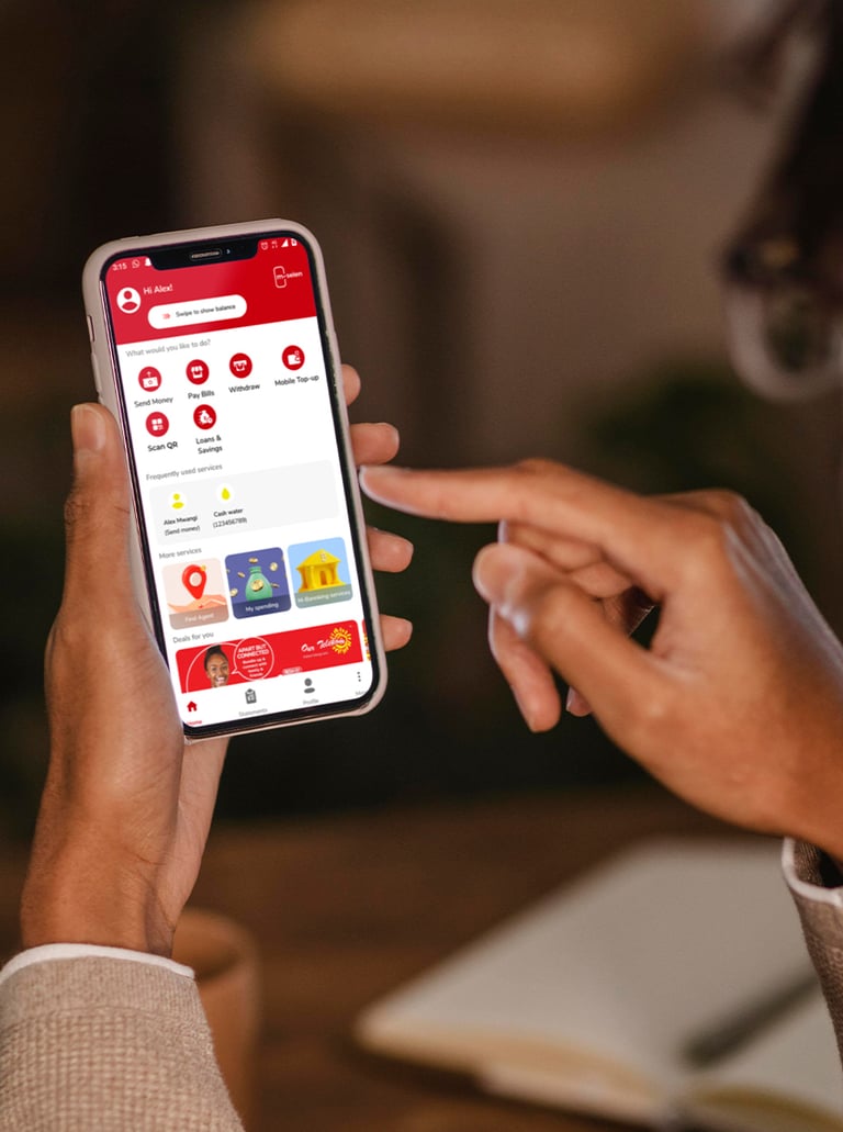
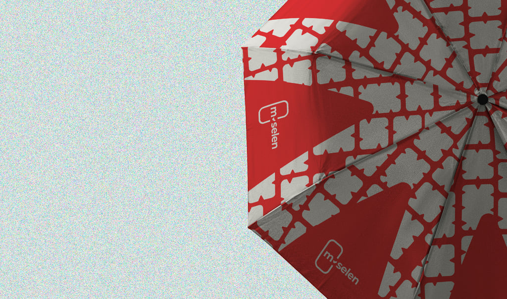
→ visual: logo, colors, typography, patterns, icons
→ guidelines: Comprehensive brand and imagery guidelines
Brand Implementation
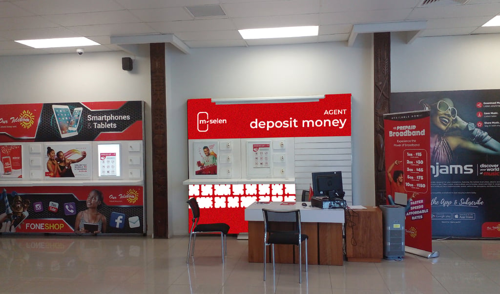
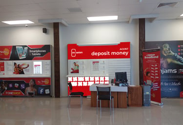
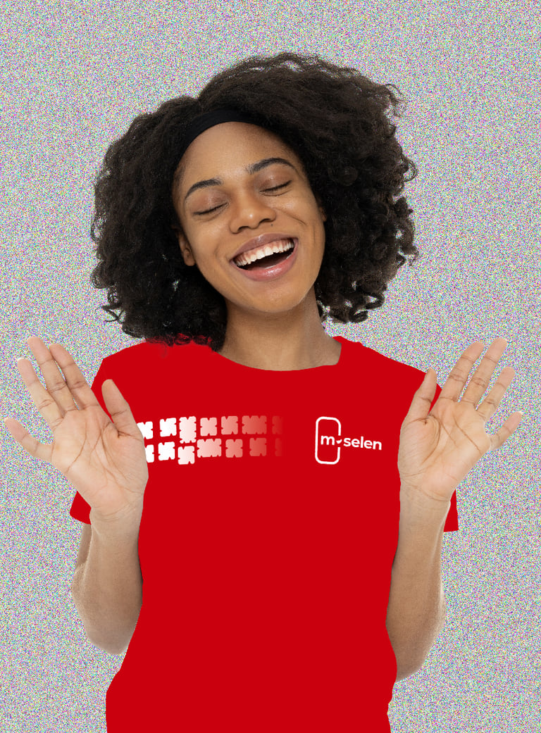
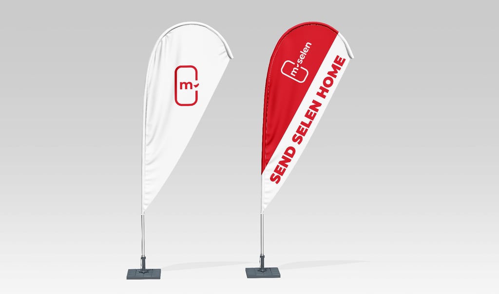
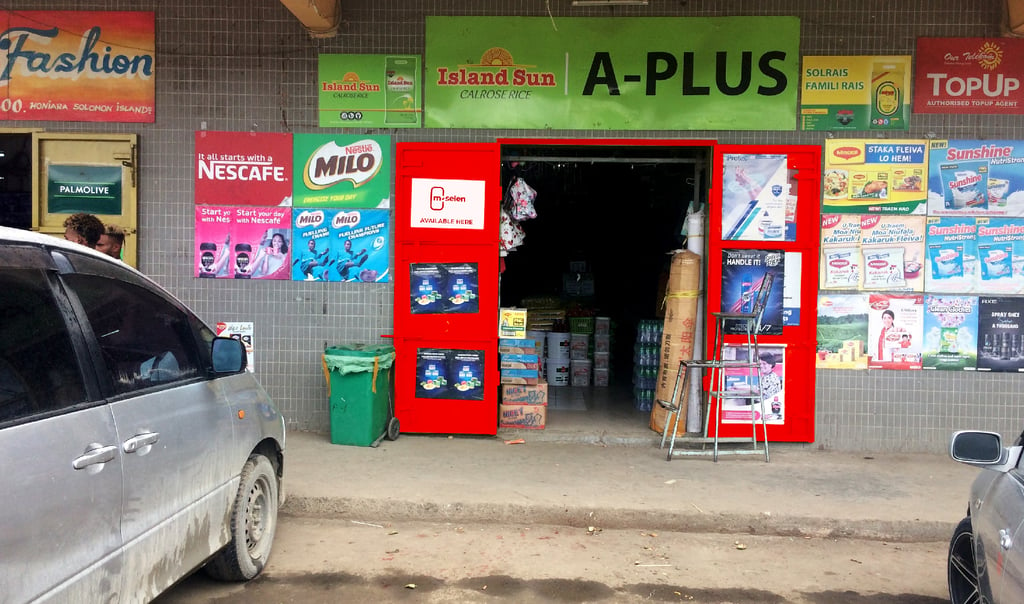
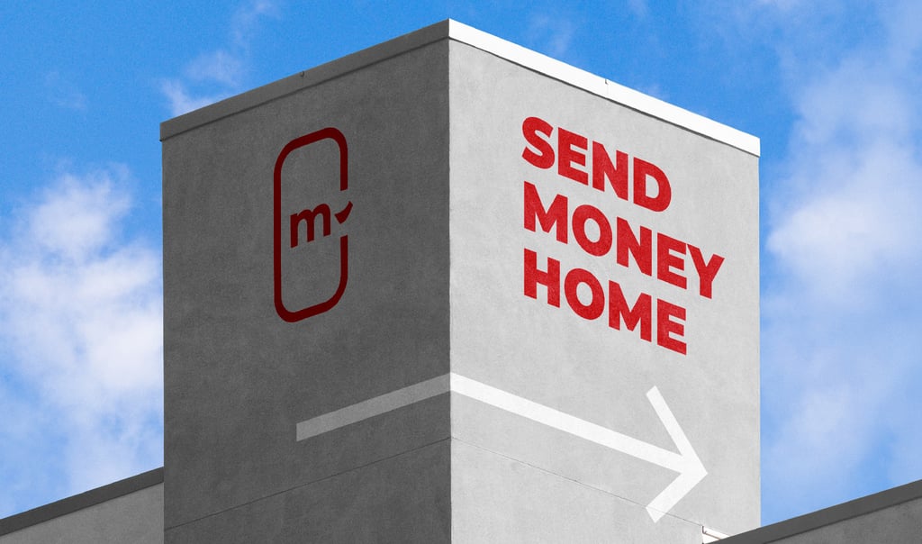
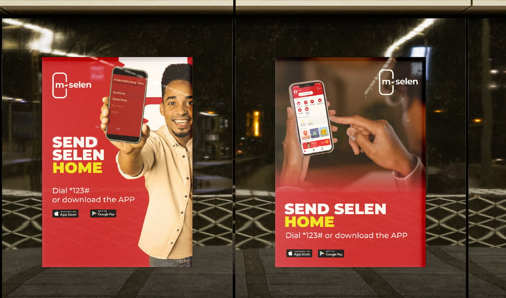
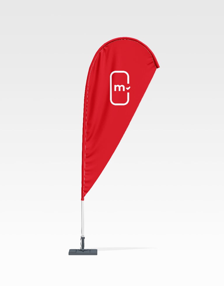
→ mockups for agents, merchandise and marketing materials
→ internal marketing and design brand training
The Challenge
The Approach
M-Selen arrived pre-launch with no footprint—awareness was zilch in a market skeptical of mobile money. Security fears loomed large, access points were TBD, and trust was a steep hill to climb.
Our Telekom needed a brand that could launch strong, easing concerns about safety and costs while proving value in a region where banks were days away.
Our task: build credibility and clarity from scratch for a game-changing debut.
From Kenya, we engaged Our Telekom virtually—strategic sessions spanning time zones—to shape M-Selen’s core. Our scope covered brand purpose, promise, personality, customer journey, and market analysis, plus a full identity (logo, colors, typography, patterns, icons) and rollout (agent mockups, merch, training).
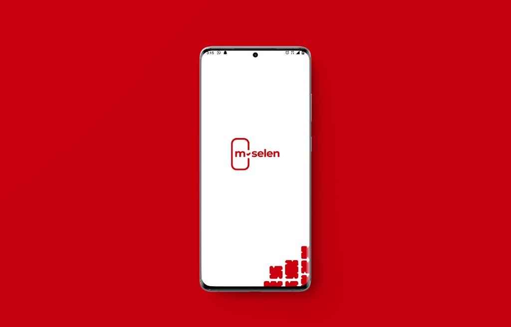
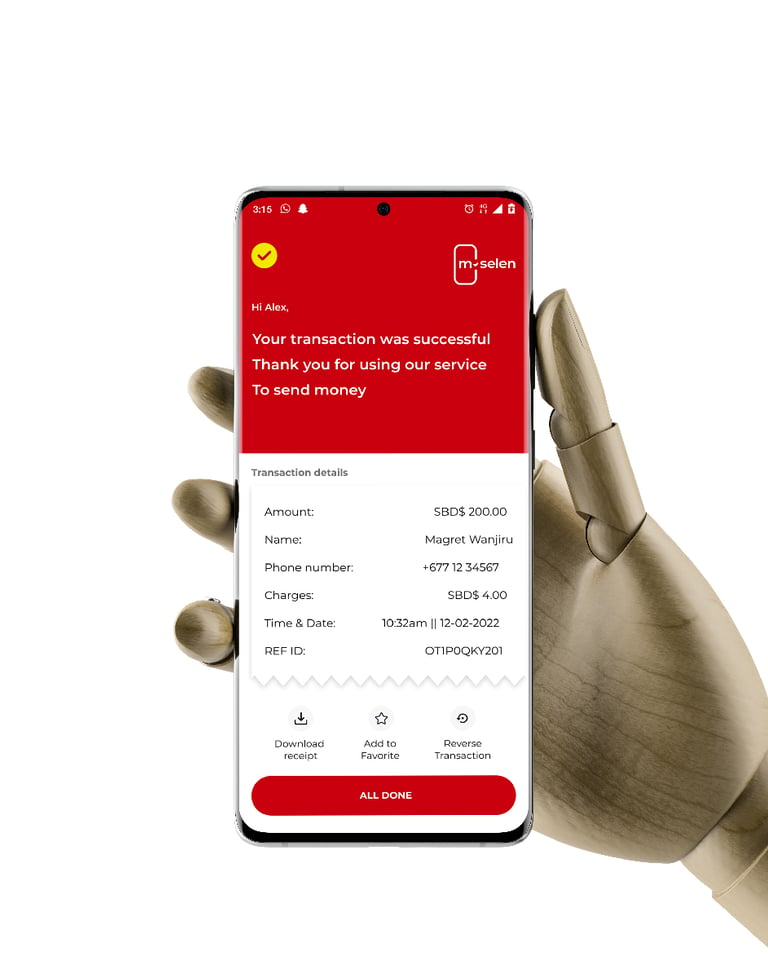
Research flagged trust as the linchpin; Montserrat font—modern, clear—set the tone. A phone-and-flying-money logo symbolized financial access with precision. Rattan shield patterns tied safety to heritage.
We delivered comprehensive brand and imagery guidelines, trained their internal team, and crafted a separate guide for agents and partners—ensuring a unified launch across all fronts.
The Outcome
M-Selen launched and seized the throne—Solomon Islands’ top mobile money platform. It clinched the Innovation and Technology Award (Dec 2024), partnered with the National Statistics Office for digital payments (Nov 2024), and marked its 1-year anniversary with heavyweights like Australia’s Deputy High Commissioner (April 2024).
Remote users now skip three-day bank treks, joining a trusted system—Our Telekom’s inclusion-first vision, backed by UNCDF, shines. A documentary (HKU Law, 2024) touts its socio-economic jolt; CEO Christina Lasaqa hails a brand that’s reached the unreachable.
Our pre-launch work—strategy, identity, training—laid the bedrock for this leap, turning skepticism into adoption and proving M-Selen’s a national lifeline.
